Product design · Fee transparency
“Costos” redesign.
Improving fee transparency and simplifying payment options for sellers.
The context
One of Latin America’s largest fintechs.
Mercado Pago processes millions of transactions daily. For sellers, understanding fees and costs was a constant challenge.
The problem
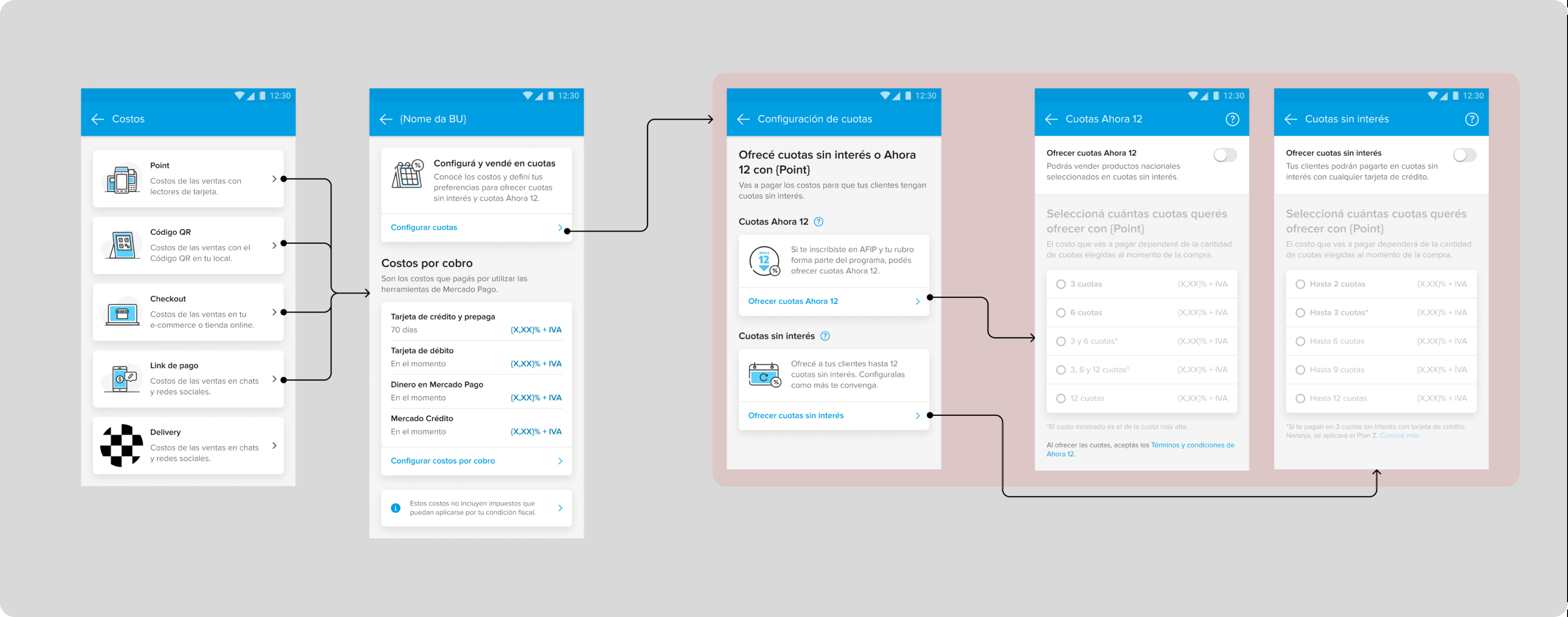
The existing section was complex and unclear.
It led to frustration, repeated searches and calls to customer support.
The solution
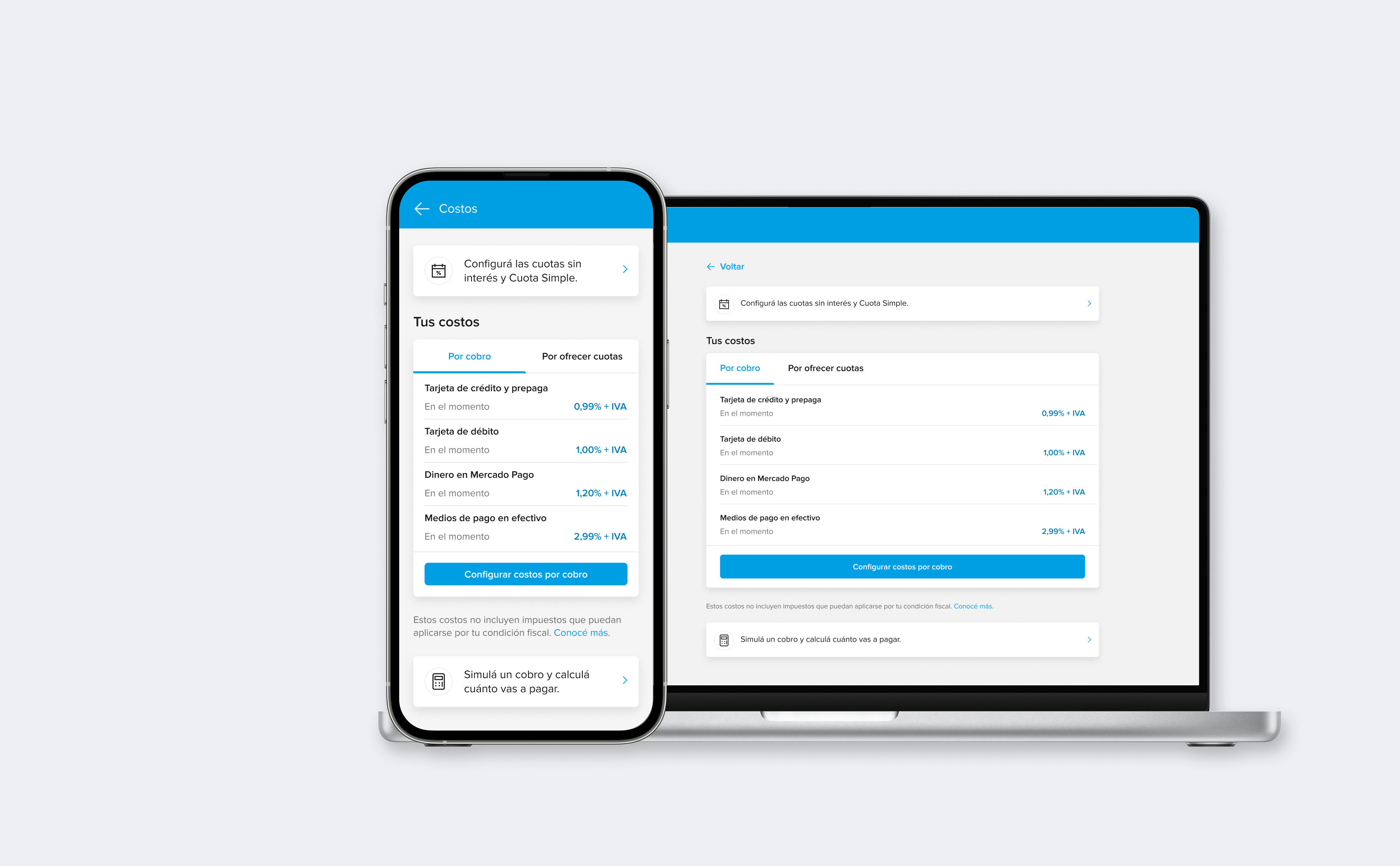
The Costs section, redesigned to turn confusion into trust.
A clearer structure and simpler payment options for sellers.
The challenge
Fees sellers couldn’t read at a glance.
Sellers struggled to understand how fees were applied. Information was fragmented and hard to find.
Many revisited the section multiple times a month just to confirm basic details. This lack of clarity directly impacted trust in the platform.
Research insights
The data showed the scope of the problem.
The project began with a target audience analysis and desk research. The insights were crucial in identifying key challenges and opportunities.
Problems discovered
- Consulting and configuring rates and terms were the most accessed destinations.
- Recurring access was predominant, over 21 times per month.
- Sellers couldn’t find what they were looking for: negotiating fees and payment terms.
High level goals
- Make the section easier to use for sellers.
- Display the main functions more easily and intuitively: view and configure rates.
Design process
Testing concepts, refining with feedback.
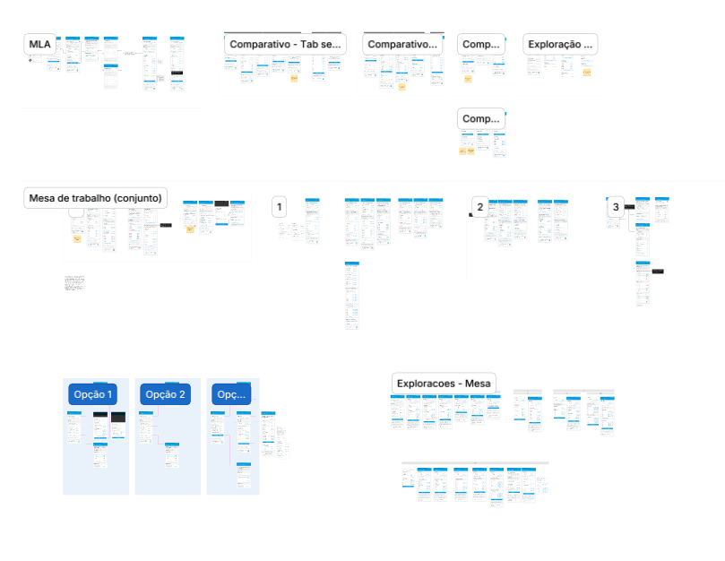
We tested different concepts with feedback from designers and business leaders, then refined the design to best meet user needs and business goals.
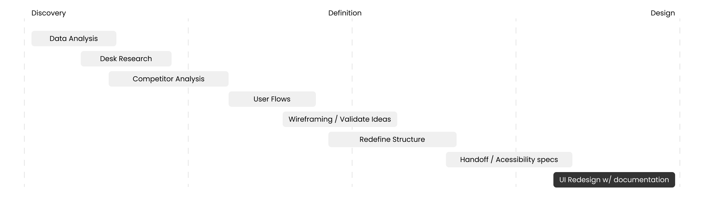
- 01
Mapping the pain points
Analyzed the flow and identified the critical points.
- 02
Exploring alternatives
Co-created multiple concepts with the design team.
- 03
Iterating through feedback
Validated ideas with stakeholders to ensure alignment.
- 04
Defining a scalable structure
Organized costs into a clear hierarchy, optimized navigation and prioritized transparency.
The solution
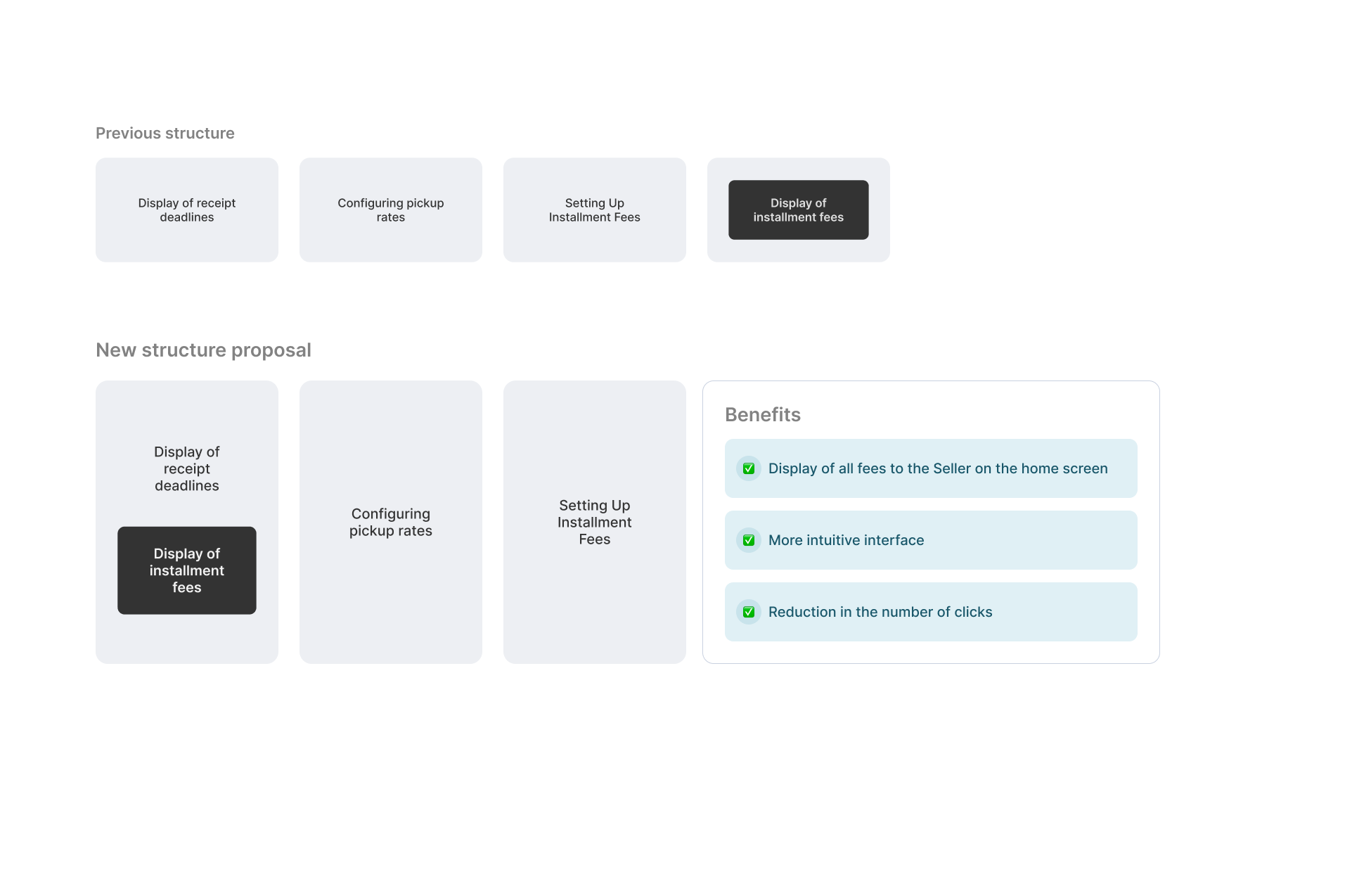
Redefining the structure.
The redesign transformed a source of confusion into a trust-building moment with sellers.
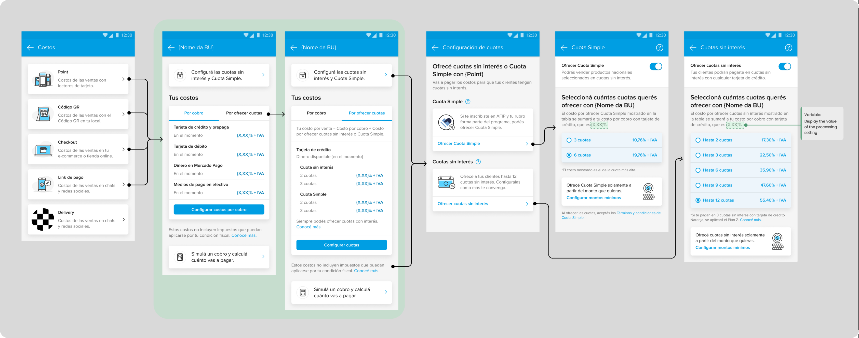
The redesigned Costs section
- Reduced clicks needed to access key information.
- Grouped fees into a logical, easy-to-scan structure.
- Highlighted the most relevant costs upfront.
- Allowed sellers to calculate and forecast expenses with confidence.
Previous structure
After redesign
Strategic impact
The new Costs section improved three things.
Clarity
Simplifying the communication of service fees to reduce confusion and improve the customer experience.
Efficiency
Creating a user-friendly interface to help customers easily understand payment options and fees.
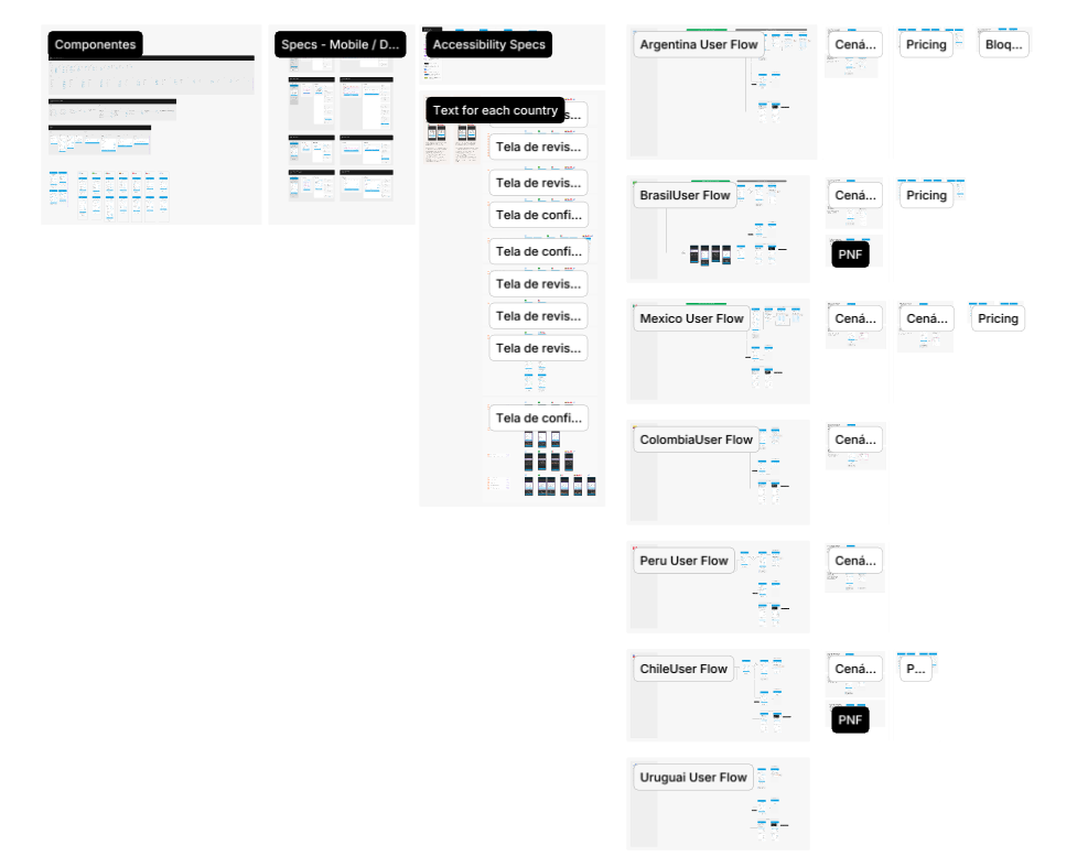
Scalability for multiple countries
A flexible solution that adapts to different tax regulations and fee structures.
7 countries
New UI
Fewer clicks, every fee in view.
Restructuring the section reduced the number of clicks to view rates and grouped similar actions. Sellers see every fee charged, for each type of payment offered.
Key findings
- 01
Making the solution scalable and adaptable to different countries ensures it works well in each market.
- 02
Clear communication of fees builds customer trust and reduces frustration.
- 03
Collaborating across different approaches and feedback gives better quality.